A Frustrating Adventure Trying To Design A Logo With AI
I started my career in tech as a product designer. Since then, AI has fundamentally changed the way most design work gets done. I’ve been having fun following along in my limited free time. For instance, last year, I taught myself Figma.
Most tools today give designers the ability to ideate alongside AI models. In general, I haven’t found them to be very useful, but it’s still early and I always figured that I might just be a n00b. After all, I haven’t been a full-time designer in 10+ years, so every time I tried using one of these AI design tools, in the back of my mind I couldn’t help but think “your inability to get what you want might be user error.”
One area of design in particular that I’ve been disappointed in AI output has been in the logo design department. I’m not sure exactly why AI logo results have been so lackluster, but I had this nagging sense that maybe if I spent an hour or two really focusing on this, I might be able to get much better results.
So I took some time on MLK day to go deep on this and see whether present AI capabilities really are lackluster or if I’m just doing it wrong.
After testing 13 AI design tools across several different prompt types, I’m forced to conclude that AI probably just can’t do a good job of creating logos at this point.
I have some ideas as to why this might be the case and I discuss those at the end, but before we get there, join me on a tour of some wonderful AI slop!
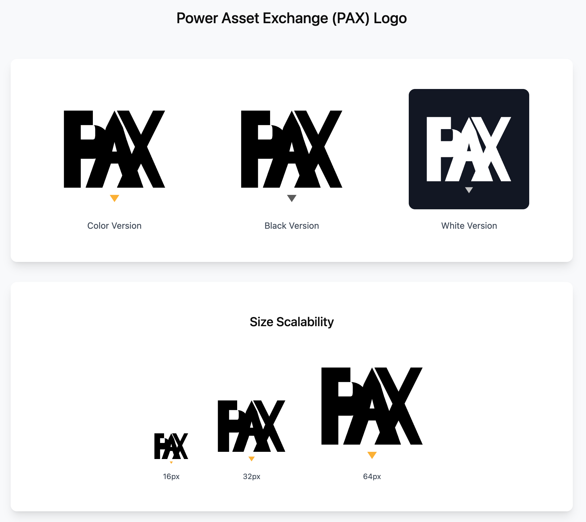
The Test Product
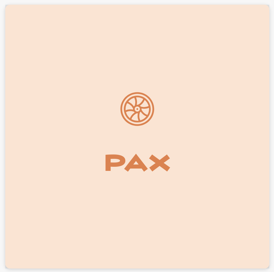
For this experiment, I decided to help a friend out with an app that he’s building. It’s a niche app in the heavy manufacturing industry. He’s calling the product PAX which is an acronym for Power Asset Exchange. Basically, his company connects power generators (utilities and middlemen) with used gas turbine parts.
I spent a couple of minutes iterating a prompt with ChatGPT and used this throughout all of the testing.
Prompt
Design a simple logo for a company called Power Asset Exchange (PAX) that helps power generators by providing them with used gas turbine parts. The company operates in the heavy manufacturing industry.
The logo must be simple. This is the most important constraint.
The logo must have a square 1:1 ratio.
The logo must be visually distinctive in both black and white and color.
The logo must be easily identifiable at the size of a favicon (16x16px).
The logo must be conceptually relevant to the brand.
To reiterate, the logo must be very simple - fewer lines, fewer themes, fewer shapes. The ideal logo has only a couple of edges and shapes and even fewer colors.
Attempt 1: Free Online Tools
I did a quick pass through some of the free logo design tools and the results were pretty bad, so I didn’t spend much time trying to iterate. My current hypothesis is that these tools are able to offer a free version of the product by using older, cheaper models and they aren’t using evals to actually measure the quality of outputs.
Looka
Logo.com
Adobe Free Logo Maker
Design.com
Logomakr
Looka
Looka doesn’t do a terrible job, but all of the logos feel like they should be for a small town CPA firm, not an innovative tech manufacturing company:
Logo.com
They paid a lot for that domain, but don’t appear to have invested much in differentiating the product. Same complaint as Looka:
Adobe Free Logo Maker
Nothing much to see here. I got several of these, but at this point, I strongly suspect that the system prompt and model that each of these companies are using is very similar:
Design.com
These are actually pretty good compared to everything else I’d seen so far. You could imagine putting in some time to tweak and simplify one of these into a working concept. Still not excellent, but getting warmer:
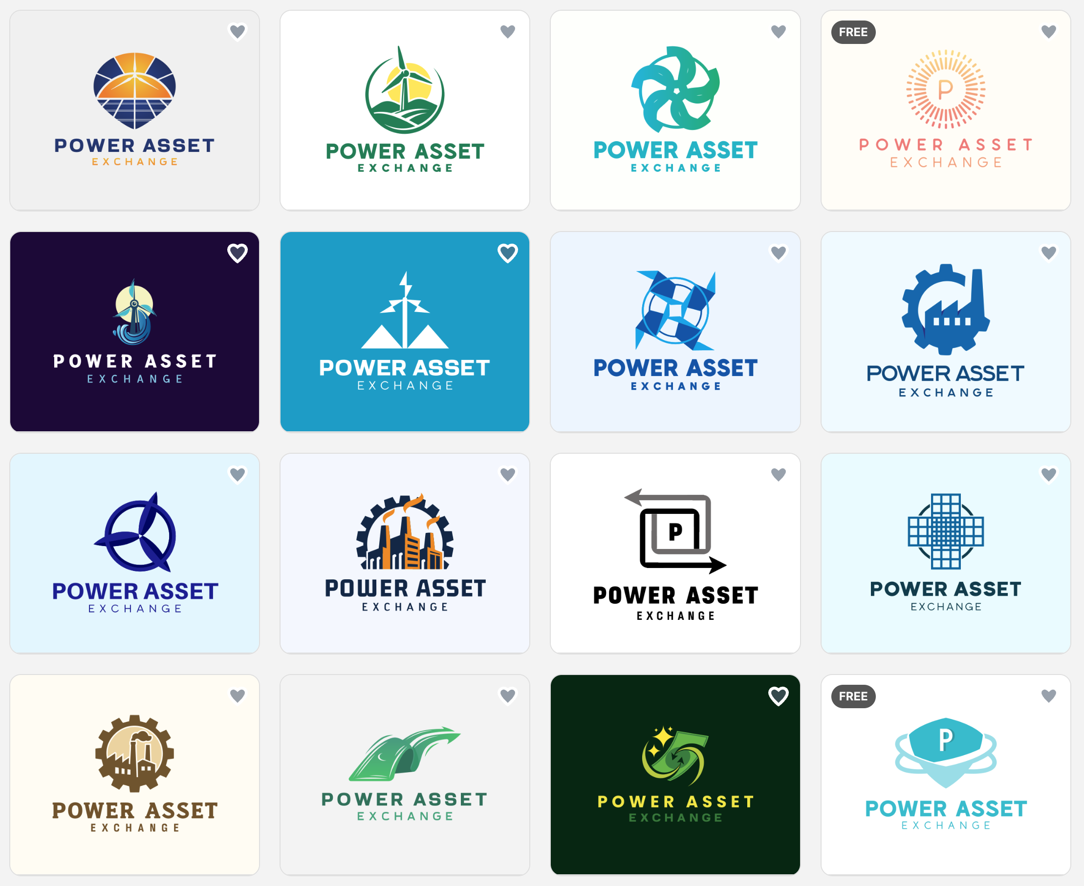
Logomakr
The guided prompt builder approach here looks promising, but the output was disappointing. It’s not terrible, it’s just not very inspired. The tool promises that you can go further and iterate, but the starting point doesn’t inspire confidence:
Attempt 2: Dedicated Design Tools
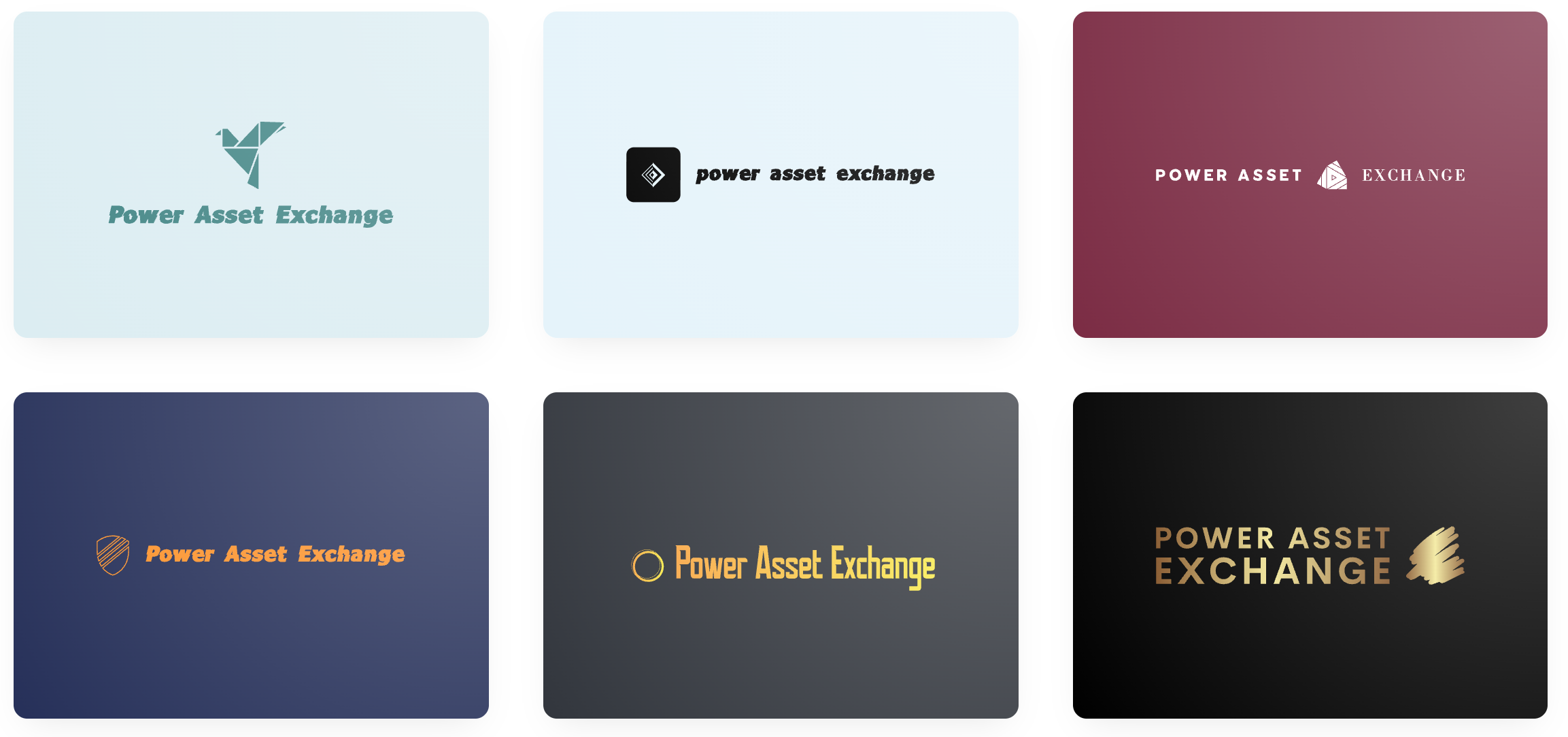
Maybe tools that are actually built for designers will perform better than the free, one-shot, off-the-shelf variety. Here I considered 5 products, some of which you’ll probably recognize:
Canva
Lovable
Recraft
Midjourney
Figma
Canva
Canva does an okay job. It created a couple of design ideas, I picked the one that looked the best:
I have no idea what the graphic is supposed to be and it has some inexplicably-complicated stuff in the middle. The font is okay, the border looks dated. Overall, I wasn’t impressed.
Recraft AI
I heard about Recraft from a friend and was pleasantly surprised by the results. Still not super inspiring, but these are at least simple and would be easy to amend:
Lovable
I got a bunch of ideas out of Lovable, but this seemed to be more of a quantity over quality approach. They were at least simple, though:
Midjourney
I know, I know, Midjourney is normally used for pictures, but why not give it a shot as well?
The black and white aesthetic is nice, but I have no idea what these designs are trying to convey. There’s no indication that any of these are logos for an energy company. Oh well, it was worth a try.
Figma
Figma is the 800 lb gorilla in the design space these days. Like all modern design tools, it has a generative AI mode. I should note here that Figma’s generative AI feature appears to work by creating SVGs rather than rendering pixels, but since it IS a purpose-built design suite, I felt like including it was fair.
Somewhat hilariously, Lovable and Figma gave me nearly identical designs:
I’ll hand it to Figma that this design is indeed simple, but there just isn’t much to connect it to a power generation company, the full product name, or the acronym.
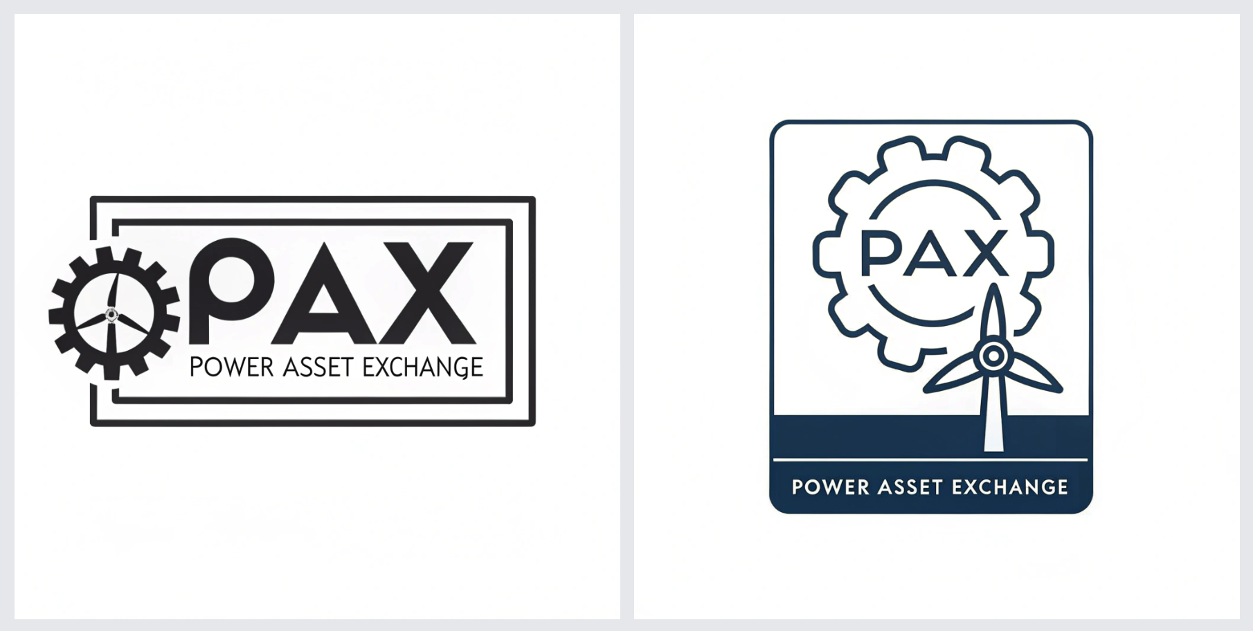
Attempt 3: Just Use The Leading-Edge Models Directly
So maybe the solution is to go directly to the best leading-edge models and do some prompt engineering to get better results. I have paid subscriptions to all the major models, so I might as well get my money’s worth, right? Here’s what I tried:
ChatGPT 5.2
Gemini Nanobana Pro
Claude 4.5 Opus (note that Claude doesn’t have native image generation capabilities, but I figured I’d give it’s SVG generation a try
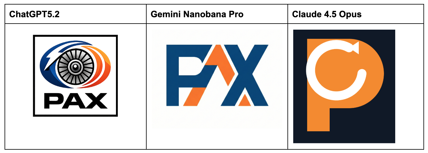
Claude’s attempt was a complete failure, but that’s reasonable given the product’s constraints.
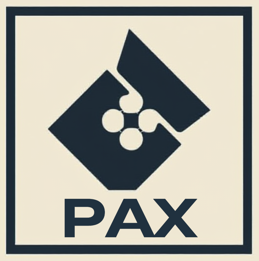
ChatGPT and Nanobana’s results aren’t terrible, but they lack consistency or a unifying concept. For instance, why is the ChatGPT logo not symmetrical? Nanobana’s attempt looks neat, but the “P” looks a lot like an “F” and I don’t know why.
Attempt 4: Starting From Examples
Up to this point, I had been using words to describe the prompt design, but what if I uploaded some reference logos in addition to the prompt?
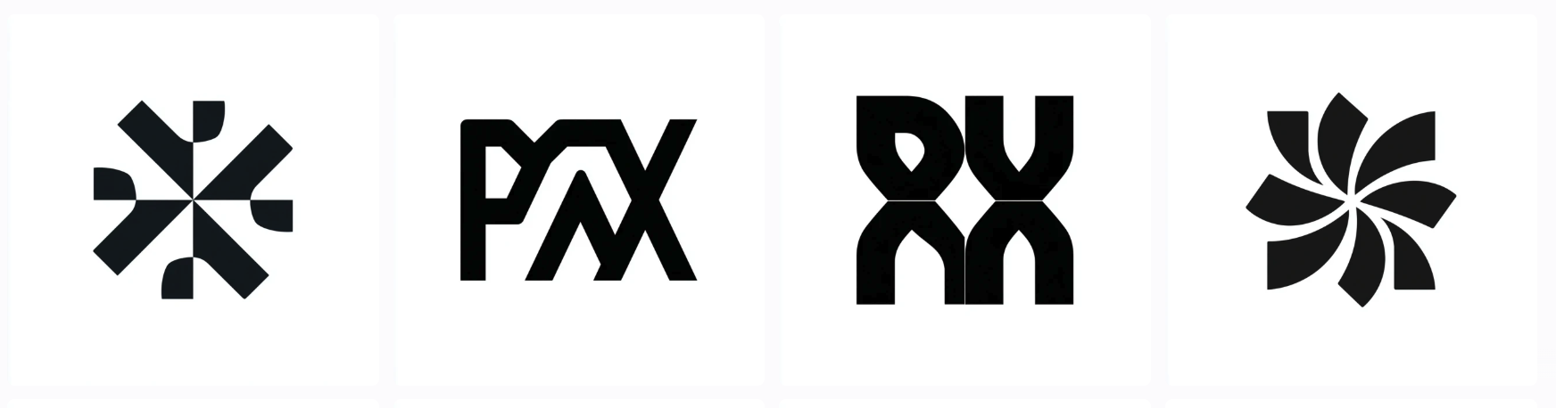
The industrial manufacturing sector isn’t a bastion of cutting-edge mobile and web UI design, but I was able to quickly locate a few clean-looking logos:
I uploaded 2 of these to Figma just to see whether the results changed much. To my surprise, I got a borderline-usable output:
I thought, “great! It’ll be even better when I add in the other data points.” So I uploaded the remaining two and … we’re back to unusable:
Conclusion
It was pretty fun trying a bunch of different prompting approaches, tools, and comparing notes. During a normal work week, I don’t have the time to really go deep to differentiate whether some AI output is garbage and I need to do the work myself or I’m just bad at prompting.
My takeaway is that at least in the domain of logo creation, AI isn’t all that useful right now.
“But George,” you might say, “there are dozens of ideas that you got for nearly free! Surely this is an improvement over what came before!”
And I would agree with that sentiment, I just don’t think it’s a significant improvement. Here’s why: actually using one of these AI-generated ideas for a real business would take a significant amount of rework.
For instance, scaling a logo down to 16x16 for use as a favicon requires more than just resizing a high-res version of the logo. To get something clean and discernable at the smaller size requires a rethink of the design elements into individual pixels.
Similarly, most businesses need a bunch of different aspect ratios to be rendered for different social media platforms, trade shows, and marketing materials. I did this a lot for my two companies and it’s a surprisingly creative process. For one ad format, you may need to isolate an element and render it alone. On a newsletter masthead, you may need to create a completely horizontal version of the logo that was designed to be square. Businesses need clean, organized underlying assets to rapidly create design resources like these.
So, while I think AI models can probably create decent fodder for brainstorming, I think we’ll need to wait for better underlying models before we can seriously talk about automating designers out of the logo creation process.